Saturday, June 13, 2009

Flesh and Francis Bacon


There is nothing pretty about humanity in Francis Bacon's art. For him, we are no different than animals, always scratching and clawing to satisfy the needs of our flesh.

No madonnas here with mothers adoringly looking at offspring. No next generation on the horizon, at all. Bacon depicts sex, but not for procreation. God is not going to save us from our lower instincts and take us to a higher plane.

No wonder Bacon's pope is screaming (left). His purple ecclesiastical garb cannot protect him from howling in pain: The pain at knowing that Homo sapiens will do whatever it takes to live during our short interlude and then we die, subject to the decay of all biological creatures. Morality and purpose in life seem to be nonexistent to Bacon.

Bacon's relationships also do not escape brutal depiction. In the double portrait of George Dyer, Bacon's lover from 1964 to 1971, (above right), a grey business suit gives the illusion of respectability. But Dyer smokes, driven by addiction, and underneath his garb, as seen in the mirror image within the painting, is his pink skin, muscle and skeleton, writhing, even though he is just sitting. Three years after this portrait was painted 1968, Dyer commited suicide on the eve of a Bacon retrospective in Paris.

Bacon's work is pure id, violence and survival of the fittest, without a hint of altruism. Except Bacon did give us a gift: He created an art that shows us some truth about ourselves.

The Francis Bacon (1909-1992) retrospective with 63 other paintings runs at the Metropolitan until August 16, 2009.

(Pictures courtesy of the Metropolitan Museum of Art: Left, Head VI, 1949, Oil on canvas, 36 11/16 x 30 1/8 in. Arts Council Collection, Southbank Centre, London, © 2009 The Estate of Francis Bacon / ARS, New York / DACS, London; Right, Two Studies for a Portrait of George Dyer, 1968 Oil on canvas, 77 15/16 x 58 1/16 in. (198 x 147.5 cm) Sara Hildén Foundation / Sara Hildén Art Museum, Tampere, Finland, ©2009 The Estate of Francis Bacon / ARS, New York / DACS, London.)

Thursday, May 7, 2009

1934 Depression Era Art Resonates Now


(Washington, D.C.) -- Between December 1933 and June 1934, in the first U.S. government program to provide direct support to the arts, 3,750 artists traveled the country to portray the “American Scene.”

It was the Great Depression. Unemployment was rampant. American confidence was shaken. Food was scarce. But the artists saw beyond the economics. They portrayed an America, still rippling with a muscularity in its people, landscapes, buildings, industries and cities.

That brawniness of America even under challenging circumstances is a physical and spiritual presence at “1934: A New Deal for Artists,” an exhibition at the Smithsonian American Art Museum of 56 paintings from the Public Works of Art Project (PWAP) on the 75th anniversary of its creation. Fifteen thousand artworks were produced in the program, costing $1.3 million.

The artists helped shape a narrative of the value of hard work, perseverance and community for the nation as it hoped to overcome the hardship of the Depression. The artists weren’t told what to paint but knew their works would get public display.

In fact, President Franklin D. Roosevelt hung 32 paintings in the White House, seven of which are in the exhibition. Another 130 paintings hung in the Department of Labor Building and 451 in the House of Representatives Office Building. Building on PWAP's success, other New Deal programs gave artists opportunities to paint murals in federal buildings and the Works Progress Administration supported writers, musicians, actors and artists from 1935 until 1943.

The aesthetic of the paintings in "1934" is deemed Social Realism, an art movement of the early 20th century that depicts working class activities as heroic, social and racial injustice and the economic hardships people face. While some of the artists may have had socialist leanings, their works are distinct from Socialist Realism, the official art of communist Russia. Both are similar in honoring the common man, but America’s social realists probably had more choice in what they painted and could criticize the status quo.

Above are three examples of the exhibition's paintings, all 56 of which can be seen on a Flickr site put together by the museum. The portrait of an old woman in “The Farmer’s Kitchen” by Ivan Albright (above left) shows the burden of life she bears and has beared, more than words can ever describe. Yet even given that hardship, she does her chores and peels her radishes. As do workers building the Golden Gate Bridge during the height of the Depression, even though they are physically absent in Ray Strong’s painting (above right), which Roosevelt hung in the White House.

Leo Breslau’s “Plowing” (below) is an idyllic landscape of a farmer plowing his field. The notes say Breslau never left his Brooklyn apartment to paint this picture, but instead relied on his imagination. They continue:

"What could be farther from the despairing of breadlines in Depression-era New York City or the Dust Bowl than this green, rustic realm where honest work is richly rewarded? The farmer, raising a new crop, offers hope for the nation.”

All the paintings in "1934" likewise offer hope to the nation today as we struggle through a new hard times. America got through that period and presumably will get through this difficulty.

Yet, the exhibition raises many art historical questions, such as how did the artists manage after they lost government support? What was the selection process in determining which artists would get support? Why did so many of them seem to paint from a similar “school of art”? What were the political ideologies of the artists and how did they influence their works? How did these PWAP works influence other artists, whose names we actually recognize and are in museum collections?

And, finally what would artists today paint given a similar mission as those from PWAP?

The exhibition runs through January 3, 2010.

(Images courtesy of the Smithsonian American Art Museum.)

Tuesday, May 5, 2009

"Younger than Jesus" at the New Museum

I wondered as I took the subway from the Upper West Side to the Bowery's New Museum if I would relate to the art at its "Younger than Jesus" show, which features works from 50 artists from 25 countries who are younger than 33, the age at which Jesus died.

As someone older than Jesus at his demise, would I appreciate the cultural and historical references of artists all born after 1976? Would I even care about what they were saying? Would the art in this exhibition, the first of the museum's to explore such a generational exploration, "transcend" its temporal framework?

As the Beatles said, yeah, yeah, and yeah. Without question, this crop of artists is asking relevant questions about identity, society, and how we got to be where we are in this moment in time, as other artists who came before them have asked of their moments.

There were works about power, AIDS, insane consumerism, destroyed environments, family dynamics, truth and illusion in images, life's meaning and life's sensations, among other important ideas.

Generally, photographs, videos, technology, site installations--and very few paintings--expressed these themes. Many works were actually quite disturbing, such as mutant cyborgs seemingly emanating from a global warming Armageddon, or screeching youngsters engaged in hateful acts in videos, or a drugged model sleeping in a bed under a white comforter while viewers observed. That's okay. Sometimes you have to scream, even silently, to be heard.

Three somewhat more reserved artists, however, resonated with me. Ahmet Ogut's staged photographs that seemed "real" provoked the proverbial question about whether we can trust what we see, especially now when we are bombarded by so many images. His pictures all seemed perfectly plausible--a woman delivering Turkish tea on a bicycle (see photograph upper left); young students without socks in a gymnasium with a loner sitting by himself; someone carrying lots of gear on a skateboard; and two girls walking in the cold and connected by a scarf. But they were completely artificial.

Liu Chang's three site installations of possessions he bought from three people ask how what we carry and wear may determine who we are. (Right.) Akin to traditional portrait paintings that depict the accoutrements of a person's profession, Liu's displays of clothing, cosmetics and cell phones reveal three people at a particular moment, maybe even their last, in time.

Finally, approximately 40 drawings made by artist Katerina Seda's grandmother two years before the elder woman's death were extremely moving. Seda pushed her grandmother to draw pictures everyday of objects (left) she could remember from the housewares store where she had worked before retiring. The older woman had been depressed and Seda hoped drawing would help her overcome a sense that her life hadn't mattered.

Vanity of vanites, all is vanity. What meaning is there for any of us? And do the experiences that define a generation, such as AIDS or the Berlin Wall coming down, make the people who lived through that time see themselves as different or related to history before and after them.

"Younger that Jesus," which runs until July 5, 2009 gives a range of answers to those questions.

(Images courtesy the New Museum.)

Thursday, April 16, 2009

From postcards to digital photography

An argument can be made that there is a direct aesthetic and philosophical connection between the early 20th century postcards collected and appreciated by photographer Walker Evans (1903-1975), which are now on display at the Metropolitan Museum of Art, and digital photography today.

The postcards (above left  of Santa Fe station, and below, a birdseye view of Lincoln, NE) which Evans liked because they presented scenes of America in a direct and artless quality, are similar in manner and intention to pictures people take every second, at this point, when they travel throughout the world.

First, let's discuss the postcards. During his life, Evans collected about 9,000 postcards, which the photographer meticulously organized into different genres, such as factories, automobiles, street scenes or New York venues. Evans also wrote articles about his postcards in 1948 and 1964 for Fortune Magazine, where he worked as an editor, and even lectured at Yale about them in 1965, before he took a faculty position there.

The Metropolitan exhibition, called "Walker Evans and the Picture Postcard," offers about 700 of his postcards, organized around his themes and, on the entry wall, for the monumentality in their smallness and similarity. The exhibition also shows how in 1936 he transformed several of his New Deal photographs, by cropping them, into the postcard format. (Above right is one of those images.) The results ultimately led to his first retrospective at the Museum of Modern Art in 1938 and his fame. In 1994, the Met acquired the Evans archive, which contain the postcards, negatives, prints, diaries and other personal effects.

The show’s curator, Jeff Rosenheim, is suggesting by the exhibition that the straightforward nature and anonymous quality of the postcards influenced Evans as a photographer. Evans started collecting the postcards before he actually became a photographer. He valued the postcards’ non-sentimental and documentary nature, which eventually became the essence of Evans’ photographic works. He never aimed to copy the images, per se. There is only one example of Evans reproducing a postcard scene.

To manufacture the postcards in Evans’ collection, which date from the beginning of the 20th century to the 1920s, itinerant photographs would shoot main streets, railroad stations, interesting buildings, hotels, seashores, new technologies, mountains and tourist attractions throughout the United States. From the negatives, printing presses in Germany and in Detroit would print inexpensive postcards, which local towns or merchants would purchase so visiting members of the public would buy them and send the images with cute little notes to family and friends back home when they traveled.

Today, people do exactly the same thing with their digital photographs of the places they visit as people in the past did with postcards. We email a photo or create slide shows so friends and family can watch the pictures on their own computer, with text captions or even voice-overs describing the images. The obvious difference between the postcards and digital photography is that today we can literally put ourselves in the picture. We control the means of expression.

But the democratization of photography started with those postcards and Evan’s co-option of them, one could argue. Evans’ appreciated the postcard form, which informed his vision of photography, that of photographers of his generation and that of all successive photographers and artists. Once Evans made accessible the “beauty” in the ordinary, such an aesthetic became apparent to us all.

What is amazing to me when I scan Flickr or other photosharing sites on the web, is how many digital photographs of staggering beauty and power so-called “average” people are taking. Some are panoramas of nature, while others are snapshots unveiling the character of an urban side street covered with graffiti, or a hotel, or a beach. Even the unusual is captured: such as an airplane landing on water in the Hudson River.

The Metropolitan show of Evans’ postcards, which runs until May 25, provides a historical context for the evolution of photography. What photography will look like in the next hundred years is anybody’s guess. But given the proliferation of social networking, collaboration among people --as in 4 a.m. project and the public-curated show of photography at the Brooklyn Museum --may play a role in photoimagery, at least in the near term. I suspect in the future we will still like buildings, seascapes and escapes from it all. Who knows, though?

(Images courtesy of the Metropolitan Museum of Art, which owns the copyright for them. Left, Unknown Artist, Santa Fe Station and Yards, San Bernardino, Calif., ca. 1910 Postcard, Photomechanical reproduction, The Metropolitan Museum of Art, Walker Evans Archive, 1994 (1994.264.1.2); Right, Walker Evans (American, 1903– 1975) [Detail of Penny Picture Display, Savannah], 1936, Postcard format gelatin silver print, The Metropolitan Museum of Art, Purchase, The Horace W. Goldsmith Foundation Gift through Joyce and Robert Menschel, 1991 (1991.1076))

Friday, April 3, 2009

19th century artists in the Middle East

When the Dahesh Museum closed its doors at 56th Street and Madison Avenue in September 2007, I was disappointed. Its collection of 3000 works of academic art from the 19th and early 20th centuries always was a sobering counterpoint to Impressionism, Modernism and abstraction in painting. The museum itself also was enjoyable with its diverse exhibitions, great gift store and a cafe that overlooked Madison Avenue.

When I heard in December 2008 that Dahesh and Syracuse University Art Galleries entered into a two-year agreement to organize several exhibitions in the university's Manhattan and upstate gallery spaces I was happy Dahesh's collection would still be available in the New York metropolitan area. Syracuse, which houses the Annie Walters Arents Collection of 19th century academic paintings, and Dahesh have collections that complement each other.

Their first venture, "In Pursuit of the Exotic: Artists Abroad in 19th Century Egypt and the Holy Land" is now showing at the Palitz Gallery in Lubin Hall, at 11 East 61st Street, owned by Syracuse University. The show runs from March 24, 2009 until April 30, 2009.
Going to academic art exhibitions requires a little work on the part of this viewer because many of the artists are not familiar to me. As I am not a scholar of art history, I know more about the famous late 19th and early 20th century artists, named Manet, Monet, Cezanne, Picasso and their colleagues, who rebelled against the academy.

But because the Palitz Gallery is small, the 27 works in the current exhibition are manageable, even if the names of the artists don't slip off my tongue. But isn't the whole point of going to see art to learn more about art?

In this case, the focus of the show was to highlight how a group of 19th century artists traveled to the Middle East to obtain accurate, first-hand views of these exotic locales. Rather than devise romanticized notions of the region from their imaginations or book descriptions, as had been done throughout the history of art by artists to depict Bible and Judeo-Christian themes, these artists painted from life. Some, such as David Roberts, wore local clothing to not be conspicous as they painted or sketched. Others even chose to eventually settle in the region.

Academic training in the 18th century taught artists to paint from life, in plein air, or on site, the exhibition notes say. Artists had accompanied Napolean when he invaded Egypt in 1798, which was the basis of the Dahesh's last exhibition, "Napolean on the Nile." But the artists in this current show, from the latter part of the 19th century, explored the region in much greater depth, traveling throughout Israel, Jordan, Syria, Egypt and Algeria. A map of Roberts' extensive travel is in the show.

When they returned to Europe, besides being purveyors of art from sites of great historical significance and their people, the artists obtained a cachet value as cultural adventurers. Artists, such as Roberts and Robert Hay, could sell multiple color prints of their works because of the newly invented lithographic printing process. They created both a supply and demand for what was then called Orientalist art. Photography, also recently invented, enabled images to be reproduced.

The paintings and prints in the exhibition capture the heat, light, dust in the desert, people, culture, commerce, history, religion and architecture of the Middle East. Marketplaces, from boat-based reed sales along the Nile to pottery and food stands in the cities and outskirts, are represented, as are holy sites and temples throughout the region.
Most of the art in the show is "apolitical" the exhibition notes say, except for one epic painting by Gustave Bauernfeind, "Jaffa, Recruiting Turkish Soldiers" in Palestine, 1888, (left), depicting the modern Ottoman Empire. Recruiting is a "euphemism for forced abduction into military service," the notes say.

"Along the Nile at Gyzeh", above left, by Charles Theodore Frere, (1814-1888) also was made without reflecting French colonial ambitions, the painting note says. But Frere eventually accompanied Empress Eugenie of France to the 1869 opening of the Suez Canal, which provided a commercial route from the Mediterranean to Egypt, and painted a "suite of watercolors at her command."

The painting, even if drawn from nature, offers a romantic view of the stillness of the Nile at daybreak with the pyramids in the background and in the foreground palm trees and cattle as witnesses to both the sunrise and the architecture. Humans, even though they built the pyramids, are absent from the image. The time depicted in the painting could be that of the ancient Eygpt or the 19th century.

That timelessness in this painting and in many others in the exhibition, has a tendency to mask the reality of the existing politics of the time. Doing so, they offer entertainment value for idealizing these Orientalist themes, then and now. For me, though, additional study of the artists, their choice of specific subject matter, their patrons and the time in which they worked is necessary. Thankfully, the Dahesh and Syracuse University Art Galleries now have an opportunity to continue to explore these academic works in their artistic and historical context.

(Images courtesy of the Dahesh Museum.)

Wednesday, April 1, 2009

Transforming stuff into art

 A week ago, if I looked at what is on my desk, I would see a computer monitor, a keyboard, a plastic water bottle, a scotch tape dispenser, a cup filled with pens, a small Buddha, a stapler and a land-line telephone. I didn't imagine these objects outside of what they are and what they are supposed to do.

But now I can conjure up a whole new life for these things. Maybe, I can cut up the clear bottle into small trapezoids, punch two holes in them and string them like fish scales on an aqua-colored fishing line to make a necklace. When the multicolored pens run out of ink, perhaps I can slice them into small tile-like squares and create a mosaic.

Frankly, I am not about to become a home-crafter. Maybe when I retire. But after going to "Second Lives: Remixing the Ordinary" exhibition at the Museum of Arts and Design , in which artists transform known objects into art, I couldn't stop myself from doing the thought experiment. Although the show opened September 27 and is closing April 19, I never made it the 10 blocks from my home to Columbus Circle to go before. I have no idea why. But, boy, I am glad I finally did, to the show and to the new museum, the opening of which coincided with the show's opening. (The museum itself is for another posting.)

Each piece in the two-floor MAD exhibition makes visible the process of creativity and stretches the imagination. The artists take objects--foil from liquor bottles, gun triggers, guns, white plastic spoons, black rubber combs, shopping bags, dog tags, tires, plastic eyeglasses, spools of thread, clothing labels, LPs, phone books, quarters, jigsaw puzzle pieces, old wood, rusty steel, buttons, safety pins--and turn them into images, sculpture, jewelry, furniture, light fixtures, you name it.

But the joy of creation is not the main inspiration for the works, made by 54 artists from throughout the world. War, politics, environmental concerns, identity and value, are some themes the art addresses. Do-Ho Suh's "Metal Jacket" , for example, appears to be a suit of armor comprised of American dog tags. The "Hope Throne" is constructed from "discarded, buried, and rusted weapons used during the brutal civil war that gripped my country, Mozambique, from 1975 to 1992," says artist Gonçalo Mabunda on MAD's website.

The press material says the "focus of the exhibition is neither on sustainability nor recycling," but points out that the "works can be catalysts for thought about these issues." A pyramid by Jill Townsley, above right, constructed from 9,273 plastic spoons and 3,091 red rubber bands seems to suggest a certain wastefulness in disposable utensil use. With time, a wall video shows, the rubber bands snap and the pyramid falls apart. Plastic spoons may be convenient for our lifestyle, but the pyramid scheme eventually self destructs.

"Textile Worker" by Teresa Agnew, above, composed of labels from clothing, thread and backing, brings attention to laborers in global markets. When I first saw the piece, I was blown away by the ingenuity of the use of the labels to create the image. But then I concentrated on its content, thinking about the difference in culture between the sari-clad woman making the clothing and the ultimate consumer wearing the labeled, designer clothes. I also thought about the hardships of textile workers compared to the lifestyle of the garment's purchaser. In the image, though, the seamstress, is concentrating and dedicated to her work, implying that her labor should be respected, not pitied. But given the downfall of the world economy, and reductions in consumer spending leading to job losses internationally, I now wonder what may have happened to such jobs.

Another example of sheer genius in using a disposable item to make art is the portrait of "Madam C. J. Walker", by Sonya Clark. The artist took plastic pocket black combs, removed their teeth in some places and kept them in others, to weave together a black and white pixelated plastic tapestry of the first African-American woman to become a millionaire. Madam Walker made her fortune by developing hair products for black women.

Clark says on the museums website: "The comb takes on more significance than its obvious reference to Madam Walker’s business since it carries with it complex layers of associative meaning: The black plastic combs evoke a legacy of hair culture, race politics, and antiquated notions of good hair and bad hair…. Combs are tools in as much as they order the fibers that we grow… when a comb has missing teeth, there is evidence of a struggle."

The exhibition offers many amazing pieces of repurposed art: Liquor labels, tapestry. Safety pins, a necklace. Old spectacles, a chandelier. A pile of auction catalogues, a sculpture of the Buddha's head. Quarters are welded together to make a chaise lounge. Scrap steel and wood, beautiful furniture. Spools of thread=Mona Lisa.

Artists in the past have taken castoffs or overlooked items and turned them into art. In 1917, Marcel Duchamp dubbed a urinal "Fountain" and submitted it for showing at the Society of Independent Artists exhibition. In 1942, Pablo Picasso took a bicycle seat and handlebars and it became a bull's head.

But "Second Lives" shows artists from our time using the materials of today to invent an art that speaks to us now and going forward into the future. Go before it closes. Or at least visit the website. You will never think of your stuff in the same way again.
(Images courtesy of the Museum of Arts and Design.)

Sunday, March 22, 2009

The garish and provocative Brücke

  When then 15-year-old teen idol Miley Cyrus, of Hannah Montana fame, posed semi-nude for Vanity Fair, in 2008, young fans and parents were in an uproar.

Her Disney Channel avatar of a regular school girl by day and a pop star by night took a beating, leading to apologies by the young performer.

When I saw the painting "Marzella (Fränzi)," 1909-10, left, by Ernst Ludwig Kirchner (1880-1938) of a naked 9-year-old girl at the Neue Galerie exhibition of Brücke: The Birth of Expressionism in Dresden and Berlin 1905-1913, I wondered what some conservative and even more liberal Germans at the beginning of the 20th century thought when they saw the picture. Although Fränzi crosses her legs and modestly covers her private parts, the big, white, innocent bow in her hair seems to accentuate the absence of her attire. Is this pornography, exploitation of a young girl or an artist pushing convention by presenting without judgment a vision of pre-nubility in a female youth?

The question is as relevant today as it must have been then. What do we think of as acceptable in aesthetics or taste and why do these ideas change or stay the same?

The small group of communally-living German artists in the Brücke, which means bridge in German, wanted to create art that would serve as a link from the art of the past to the art of the future. "Drawing on diverse sources, ranging from medieval woodcuts to African and Oceanic art, the artists fused these influences into a highly distinctive style," the press material says. "Through their art, they sought to restore a sense of value and unity in a fragmenting world." They become the predecessors of German Expressionism, an art exploring pure emotional expression.

What is so interesting about the the Brücke and the many other artists in Europe and America working in the early 20th century--following on the work of post-Impressionists--is how they forever revolutionized Western art. A Renaissance-based view of reality in art would now become only one of alternative means of depiction. For example, the wild beast Fauves in France, inspired by Van Gogh, used brush strokes of pure colors to shape forms, with a minimal attempt at blending, similar to the Brücke artists. Arthur Dove in America was painting pure abstraction.

Also like the Brücke, contemporary cubists in France were paying homage to images of beauty from other cultures, such as Africa. Pablo Picasso's "Demoisselles D'Avignon," 1907, was inspired by African masks, El Greco and Iberian art. Demoisselles also confronted middle class values of propriety, by portraying prostitutes and sexuality, at least from a male artist's perspective.

The Neue Galerie exhibition, the first major showing of Brücke artists in the United States, divides the 100 or so works mainly into street, nature and studio-based imagery. Many of the paintings use psychedelically bright colors together, such as red and green, or pinks and yellows, that have absolutely no place in nature, in reality. The distorted houses and chaotic street scenes, see right, Kirchner, "Berlin Street Scene" (Berliner Strassenszene), 1913-14 Oil on canvas, Neue Galerie New York and Private Collection, are not urbane and sophisticated but humanity pushing, scraping and rushing up against each other in crowded environments. The faces of people in the portraits peer directly at the viewer, not in a posed or calm manner. Even a pink lighthouse in a rural enviroment does not seem to provide solace from a possible storm.

The images are disturbing. They are challenging. They are provocative. They are garish. The fervency of the time is quite apparent. The confrontation of international and socioceonomic cultures, uncertainty about the future, an attempt to create new identities, and the resulting angst are omnipresent in these paintings. The resulting feelings, we a hundred years later, can certainly relate to.

(Images courtesy the Neue Galerie, "Marzella (Fränzi)," from Moderna Museet, Stockholm.)

Thursday, March 19, 2009

Why art in hard times?

That approximately 12.5 million Americans are currently unemployed is staggering. What are all those people doing without having a place to go to for work? Although looking for work is a full-time job, it can be discouraging when there is no work to be found. How are people going to adapt to the changing economy?

What can a museum or art offer to jobless people who are terrified that in a few months to a year, they might not have enough money to support a family or be able to stay in their homes?

"Historically people use museums more in tough times (economic/wartime)," says Chicago's Museumist, a forum for all things museum- related, through Twitter. "Perhaps it is a form of escapism or quiet place to think. So, I think now more than ever museums (particularly art) need to step up and realize that in tough times people look to them for comfort."

The Dallas-based Womens Museum, points out via Twitter that many museums are accessible, inexpensive ways to experience culture: "Museums are cultural centers and are open to the public - they can educate and engage for little or no cost."

I guess, I would have to say, that for me, museums and the "culture" within them represents humanity's instinct for creation and continuation--even in dark times--rather than destruction. While art has been used for propaganda and self-aggrandizement, even a painting of a historical battle promoting the victorious or a vicious ruler's portrait provides a lens to the past from which we have emerged. Life has been awful before, without question, and somehow we human beings have muddled on, even creating monuments to ourselves in the form of art.

Survival, however, may not be inspirational to some. For others, religious art, regardless of the religion represented, provides quiet contemplation, because it was made to express spirituality. Similarly, modern abstract art can offer a meditation, a relaxation or even a release of irritation, "My kid can do better than that." And many kids, inspired by the history of art, actually do indeed go on to become artists, continually adapting to the changes in technology offering representations via the web or video.

But catharsis through annoyance or tears may alone just help relieve tension. The beauty of certain paintings can make me cry. There also have times in my life when sadness would dissipate in the presence of art. I would go to a museum feeling down and a painting would engage me. I would try to figure out what this artist, most likely working alone in his or her studio or in plein air, was trying to say to me, some unknown viewer. Such non-verbal communication via color, texture, subject matter and composition across decades and centuries really is a remarkably primal, sensual, intellectual and reinforcingly human experience.

"We need art for escape," says Lori McNee, an Idaho artist via Twitter. "Art is universal language, [and] remember art is at the forefront of any great era."

(Image courtesy the Library of Congress, Prints & Photographs Division, FSA-OWI Collection, Reproduction number, LC-USW33-035391-C DLC, from 1930-1935, a bread line by the Brooklyn Bridge approach.)

Monday, March 16, 2009

"Following" art on Twitter

to scan my Twitter "art-based" stream feels like a form of madness. I click on abbreviated urls, spend time finding people to follow and then have them follow me. There is no structure, per se. It is sheer randomness. Yet I do it.

Much of the 140-character art "lineage" is self-promotional, such as museums or artists linking to their current exhibitions or cool things, which is fine with me. I wouldn't know what a Cleveland gallery is doing from my local New York City media. But alot of the abbreviated, hypertexted verbiage is also just a way for folk to share links to images, galleries, artists, artblogs, antiques, pretty pictures, ugly pictures, flickr streams, videos, neat visual stuff or photographic tips. Or at least that's who I choose to follow. I am not interested in consuming "I ate a bagel and cream cheese for breakfast."

So what criteria do I use to look at a link? Clever or humorous writing gets my attention. Soon you realize you are in sync with some people's aesthetic taste more than others and you will routinely hit their links. Also, I like retweets, or RT, because they have been filtered by an "editor," so I think they might be worthwhile. (I know, I am so old-media) I like to RT, too.


How do I choose to follow someone? I look at the followers of my followers and followings and go through 'em to find new sources and victims. I also search Twitter for terms, such as art, artists, museum, etc. I checked out the Twittering art leaders on WeFollow, too, and hooked to a few of them. (Last I looked at WeFollow, RobinLe, me, was #112, but it doesn't seem to update so frequently. I should have been more careful about having my Twitter and blog identity, artfultext, the same, but when I started out I didn't know what I was doing. And now, I am an such an expert, hah.) I am also sure there are better ways to find twittermates, but I am not a new adapter and haven't felt comfortable giving passwords to my Twitter accounts or control of my computer to Twitter-efficiency software. I am not yet a mobile Twitterer, fearing I could too easily get addicted. And yup, as the Twitter tiptweets say, the short profile and link to a website or blog, showing off one's art or writing, suckers me in.

But why am I doing this? I figured Twitter would be a natural fit to "learn" about art because it is relatively new and it enables visual, text and video expression. (And my Facebook "friends" aren't that into art. I am what you could call a somewhat trained-in-the-arts, art enthusiast.) So I decided to experiment. Initially I was skeptical. How can you say anything in so few words? But some people are really good copywriters and there is a staggering amount of good art to link to in the universe. (As there is Twitformation on so many other topics, some of which I also follow.)

What have I learned to date? People put significant sweat equity in their art, websites, blogs and tweets, for some hope, I guess, of a return on the investment. All my life as a professional writer (on other topics) I have been paid for my words. But I must say, I take great inspiration from the artists and the art tweeters. Artists create without knowing necessarily beforehand if anyone is going to buy or appreciate what they make. They apparently don't care about competition, repetition or today's recession. They keep doing it, crafting a "market," one tweet at a time. The bigger picture, if there even is one, still evades me. Though, I am sure someone is going to figure out how to make money off of me. Feel free to follow me on Twitter.

Wednesday, March 11, 2009

End arts philanthropy?

Peter Singer, apparently, is trying to goad us into doing the right thing and to personally contribute to ending world poverty, according to a review of his new book "Acting Now to End World Poverty" in the New York Times. I agree. We could all do more to help those less fortunate than ourselves. Personally, even in these economic times, my family gives as much money as it can to different philanthropies and we are no Gates Foundation.

But, like the reviewer, Dwight Garner, I have to take issue with Singer for the following quoted statement in the Times:

“Philanthropy for the arts or for cultural activities is, in a world like this one, morally dubious,” he declares. The Metropolitan Museum of Art bought a painting by Duccio in 2004 for more than $45 million, an amount, Mr. Singer says, that would pay for cataract operations on 900,000 blind or near-blind people in the developing world.

He continues: “If the museum were on fire, would anyone think it right to save the Duccio from the flames, rather than a child?”

I think Singer creates false choices pitting a child or poverty on the one hand against the Metropolitan Museum of Art, on the other. If you take Singer's argument to the extreme, why even have cultural institutions at all? They just waste money and resources that could be better spent elsewhere.

But, I think, places like the Metropolitan Museum expose people, of varying economic means in a city like New York (where I live) to all the different cultures of the world, asking viewers to respect humanity's similarities and differences. What would be the point of living in a world where you could restore vision but the cultural history of our achievements was gone?

Yes, we may be living through a global recession, but there is still room for philanthropy in the arts, in medicine, for the homeless, for the hungry and for the needy. Yes, the $45 million Duccio is a large amount of money, but Singer would probably like to stop supporting the arts completely. Imagine what the world would be like if all the philanthropists, whose name line the walls of the first floor of the Metropolitan and the different gallery spaces, didn't give their money to the Metropolitan or other cultural institutions?

I surely would not want to live in a world without the Metropolitan Museum of Art.

Sunday, March 8, 2009

Art in my neighborhood!

Sometimes it is difficult to find art in the Manhattan streets you walk every day. In the six block radius that I traverse in the Upper West Side of Manhattan, mostly it is commerce that rules: Barnes & Noble, Food Emporium, the Gap, Pottery Barn, Ugg, Loew's movie theater, restaurants and other businesses. No galleries line the boulevards here. On certain days, though, reflections in apartment building windows can be visually arresting and five people will walk by all wearing red.

But usually the trek around the area generates the mundane: groceries and sundries. So there I was walking on Columbus Avenue between 67th and 68th Streets and what do I see? An installation of video art in the window of the former Reebok store, which has been empty for about a year. Whoa! Art on Columbus Avenue. Given so many empty storefronts nearby--Circuit City on Broadway gone, Cafe Mozart on West 70th Street gone, among others--video art seems an innovative way to keep the spaces vibrant through the recession and the ailing real estate market. The attention might also help lease the property.

Ellen Scott, spokesperson for smartspaces.org, which put together the exhibition, says she hopes the Columbus Avenue location will bring more attention to the project. "We think the current economic conditions will spur more people to seek creative solutions [to their spaces]," she writes in an email. "Smartspaces is just starting up--we're planning to produce six to eight spaces in 2009, and scale much larger once we raise enough resources." Their inaugural venue is 266 West 37th Street.

All they need for publicity at Columbus Avenue is a local or national reporter from ABCNEWS, located across the street, to notice and, voila, mainstream media interest. But on Sunday, most passersby with cell phones in hand, shopping bags or baby carriages, hardly registered the flickering images in the window showing seven different video artists' work projected on an extremely thin screen, provided by openPLAYER. Had anyone stopped, they could have texted comments that would have been scrawled across the top.

Although I received some quizzical looks from pedestrians, I stood there and watched the half hour's worth of videos. It was worth it.
  • There was Ana Prvacki's "goose step" dance between a rather aggressive goose and a woman in a purple dress "tangoing."

  • Francisca Caporali (Brazil) and Mary Jeys (USA) offer animated explosions superimposed on different real locations in New York City.

  • Three "Forget Me Not" videos by Trine Nedreaas present individuals vying for attention: a woman sword swallower, a guy breaking concrete slabs with his head and a man eating a plate filled with sausages.

  • Venetian blinds opened and closed to reveal a changing urban landscape in "Cegueira" by Jessica Mein. Another by Mein, "White Shadow" has a figure almost fighting its shadow with a shovel.

  • "Delicatesse" by Triny Prada shows a hand cutting a small sliver from a seed pod in what appears to be a rain forest, seemingly reminding of our continual exploitation of natural resources to sate our needs.

  • "Mounted Horse Men," by Christy Gast, was most intriguing to me. She spliced videos of a man explaining cave paintings, of a painted pueblo settlement with the message "Jesus is the answer," of a guy fixing the stones on his house, of a donkey and other caves. All I could think was how someone in a thousand years was going to find meaning in our current cave paintings: YouTube videos and these video art works.

The Columbus Avenue opening, the press material says, was meant to coincide with other art fairs going on in New York City in early March, such as the Armory, Fountain and Scope exhibitions. But frankly, after recovering from a stomach bug, I wasn't feeling well enough to go too far from home. And given this economy, I wasn't about to buy any art at these art shows, either.

So thank you, smartspaces.org, for bringing art into my corner of the world.

Wednesday, March 4, 2009

"The Third Mind" @ the Guggenheim


Each work of art in the "Third Mind" exhibition at the Guggenheim Museum, represents a step in a journey, not a destination, as the expression goes. But, even so, I must say, getting to the top of the spiral ramp was quite the culmination to a two-hour trek through the history of contemporary American art.

The point of the exhibition is to show how Asian art and ideas, as co-opted by American artists, influenced the development of a range of modern art American movements from the mid 19th century until now. There's approximately 250 works on display with examples of aestheticism, tonalism, abstraction, calligraphy, minimalism, video and performance art. More than a 100 artists (and writers and musicians) are represented.

Curator Alexandra Monroe says the "Third Mind" [from a William Burroughs Beat work that combines and rearranges texts to create a new narrative] challenges the widely-held view that American modern art evolved from a dialogue with European impressionism, cubism, expressionism and surrealism. Instead, she says imagery and ideas from the East more directly changed Americans sense of nature, existence and consciousness in their art. Seminal American artists, the show points out, even lived and worked in Asia.

(Europeans, though, I would add, also were also influenced by Asian art and ideas. Edouard Manet's 1868 "Portrait of Emile Zola," also flattens perspective and pays tribute to Japanese art. The 2-D surface of the painting is important to Manet, leading to the slippery slope, one could argue, to abstraction, too.)

Nevertheless, what struck me about the "Third Mind" was how the Eastern mindset contributed to changing the relationship between the work of art and its viewer, a bond, of course, still evolving. As time progressed, the ego of the artist as expressed in the work of art begins to disappear, in a manner analogous to the concept of selflessness in Buddhism. With time, the artist's role lessens as the viewer plays a more important part. Of course, as much as the artist "vanishes", he or she never quite escapes.

A viewer, for example, interprets the 1904 photograph of a canal in London, [far left] by Alvin Langdon Coburns as an atmospheric study in shadow and light pretty much as the artist presented it. But the viewer has to work a little harder to understand the white mesh network in Mark Tobey's 1944 "Crystallization" [upper right], even though the tempera paint has been carefully applied (more so than Jackson Pollock's paint drippings).

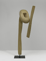
Isamu Noguchi's 1959 "Cry," [bottom left] seems to have elements of an open mouth in a crying face, perhaps an upraised arm in pleading, too. But that is purely my "vision" of the sculpture. Ultimately, with John Cage's 1952 4'33'' silent symphony, the ambient sound of the audience and the environment becomes the performance.

That dialogue between artist, work of art, and viewer obviously continues today. James Lee Byars"The Death of James Lee Byars," 1982/1994, [bottom right], one of the first pieces in the show, is a room you enter to live in the present moment, the audioguide says. It is a gold-leaf covered monument to the transitory nature of life and its ultimate demise. The artist would come into room, lie down on the altar and leave behind crystals. Although the gold leaf is peeling in some places, perhaps to mimic decay, the overall effect is still quite impressive. The ego of the Byars, like that of the pharoahs in Egypt, is quite apparent, even if the ephemeral nature of life is the theme.

Interestingly, the last "stop" in the ramp in the "Third Mind" brings you back to the main floor, by way of an installation piece by Ann Hamilton, commissioned by the Guggenheim for the exhibition. In the work, Tibetan bells follow a winding track along the walls of the Guggenheim's rotunda, ringing intermittently along the way. At the bottom floor, behind a curtain, the bells bang into a bunch of waiting cut-up books, which then plop to the floor. An attendant on the top floor, then pulls up the bells and hoists down more books for the process to start again. The piece, Hamilton says, represents a visual metaphor for the process of "reading, which leaves no material trace but which might forever change you."

Without the explanation, I thought Hamilton's work was about trying to use a symbol, the bells on the track, as a way to integrate the works in the exhibition into a whole, which is possible--the curator did it--and impossible--so much to absorb. I think my"interpretation" is consistent with artist's explanation and with curator's intent for this show. Monroe has imposed a powerful paradigm on the many disparate works in the exhibition. She has changed the way I will forever look at these artists' works and other current modern art, which, without question, owes a lot to these predecessors.

(Images courtesy the Guggenheim Museum. Alvin Langdon Coburn, "Regent's Canal, London," 1904, Photogravure print, 21.6 x 17 cm, George Eastman House International Museum of Photography and Film, Rochester; Mark Tobey,"Crystallizations," 1944 Tempera on board, 45.7 x 33 cm Iris and B. Gerald Cantor Center for Visual Arts at Stanford University, Mabel Ashley Kizer Fund, Gift of Melitta and Rex Vaughan, and Modern and Contemporary Acquisitions Fund © Mark Tobey Estate/Seattle Art Museum Photo: M. Lee Fatherree Photography; Ismau Noguchi, "The Cry," 1959, Balsa wood on steel base, 221 x 85.1 x 47.6 cm including baseSolomon R. Guggenheim Museum, New York66.1812© 2009 The Isamu Noguchi Foundation and Garden Museum, New York/Artist Rights Society (ARS), New YorkPhoto: Kristopher McKay, The Solomon R. Guggenheim Foundation, New York; James Lee Byars," The Death of James Lee Byars," 1982/1994Gold leaf, crystals, and PlexiglasDimensions variableVanhaerents Art Collection, Brussels, Courtesy Marie-Puck Broodthaers, Brussels© Estate of James Lee ByarsPhoto: Courtesy of Michael Werner Gallery, New York and Cologne, and the Estate of James Lee Byars.)

Tuesday, March 3, 2009

Borderless art: Bonnard's late paintings

Something about the perspective, color, flatness and yet depth, in Pierre Bonnard's late paintings exhibition at the Metropolitan Museum of Art remind me of David Hockney's interiors.

Although separated by a little more than a half century, both artists dissect the picture plane into facets, not unlike cubism, yet still maintain the essence of the space or reality being depicted, with the image somehow transcending the border of the painting.

Revealing Bonnard's (born 1867) modernism is the intention of curator Dita Armory in the Metropolitan Museum of Art's exhibition of the artist's late paintings, made from 1923-1947, while he lived in a house in France overlooking the Mediterranean until his death. I am convinced.

The Metropolitan Museum of Art press release and the exhibition copy explains how Bonnard did not work from life, directly, but would make sketches and then synthesize the paintings from memory, using the most luminescent, opalescent, mauvescent, whitescent, colors imaginable.

But besides fluttering every color from a shimmering pastel rainbow palette onto the surface of his canvas, his intimate interiors, still lifes, and window views extend their reach beyond the painting, almost capturing the curve of the earth, if you stand far enough away to look at them, while at the same time zeroing on a table with a breakfast waiting to be consumed.

Impressionists often relied on somewhat traditional and aerial perspectives in their representation of reality. Bonnard, a so-called post-Impressionist, seems to have created his own perspective, like Mr. Hockney. No reproduction, postcard, website image or words can capture that vertiginous sensation of nearness, depth, distance, color and immediacy. No wonder the exhibition was so crowded on a recent Saturday.

(Images courtesy of the Metropolitan Museum of Art. Left, Pierre Bonnard, "White Interior," 1932, (Oil on canvas, 43 1/8 x 61 3/8 in. (109.5 x 155.8 cm) Musée de Grenoble Photography © Musée de Grenoble © 2008 Artists Rights Society (ARS), New York / ADAGP, Paris); Right, Pierre Bonnard,"Dining Room Overlooking the Garden,"(The Breakfast Room), 1930-31, (Oil on canvas, 62 7/8 x 44 7/8 in. (159.6 x 113.8 cm), The Museum of Modern Art, New York. Given anonymously 1941, Digital Image © The Museum of ModernArt/Licensed by SCALA/Art Resource, N.Y.))

Monday, March 2, 2009

Outsider art from New Zealand


Self-taught artists who work outside mainstream culture show a very human drive to create, even if it is mental illness sometimes that inspires the scrawls on paper with pen, pencil or paint. These so-called "outsider artists" are not expressing themselves using the signs, symbols or perspectives of an art history they learned at university. The imagery is coming from a deeper place, inside the folds of their brain writ large on wood, canvas, paper or whatever material is available to alter with their hands using color, line, text and shapes.

Each work is unique, but interestingly, because each is made by Homo sapiens, similarities of subjects and techniques exist among the artworks. Some are realistic while others are abstract. Some reveal spiritual or religious themes, others are almost mathematical in their precision.

In a manner analogous to Darwin studying the evolving forms of animals in the remote Galapagos Islands, in 2001 Stuart Shepherd, formerly an art teacher at New Zealand's Massey University, surveyed the visionary and self-taught art in his country. Ultimately, he amassed 3,000 2-D and 3-D works, which he has organized on a web site, "Self Taught and Visionary Art in New Zealand," and in a gallery. He also developed a taxonomy of categories to characterize the art. They include geometry, exoticism, text-based and preacher art, Maori-themed and others.

Shepherd, partially supported by Arts Access Aotearoa (the indigenous name for New Zealand) is now bringing the works from his gallery to the world. Recently, he brought some pieces to the New York's "International Outsider Art Fair," (Jan. 9-11, 2009) the first time New Zealand works were shown there. "Andrew Blythe created a splash, with a good review on Artnet.com, "Out is In"," Shepherd wrtes in an email. Blythe falls in the "obsession decoration school."

Shepherd has works in New York's "Fountain Art Fair" (Mar. 5-8). Additionally, he is collaborating with the Creative Growth Center from Oakland, Calif., a group dedicated to helping adult artists with mental and physical disabilities. Last year, the center opened the "Gallery Impaire" in Paris, France, where Shepherd is developing a show with work by self-taught and contemporary artists in video and photography.

"The idea is that the photography and video work will provide a context for the work on paper," he says. "It will be a kind of showcase for New Zealand art, the loose theme will be around the notion of normalcy."

"...Any publicity generated is appreciated and will help me prove to the gate-keepers of the arts institutions in New Zealand that there is something of real value in [this type of art]," Shepherd writes. "Even though they didn't study it in school."

(Images, courtesy of Stuart Shepherd. From left, Teressa Woodrop, "Circles" (acrylic and sand on canvas); Andrew Blythe, "No, No, No," (2008, acrylic on paper); and Justin Morshuis, "Eyes" 2008, (pen on paper))

Thursday, February 26, 2009

The seeded apple of my eye

Pomegranate seeds and their surrounding pulp are edible bursts of tart crimson with crunch. In the west, pomegranate juice, touted for its antioxidant properties, has become the ingredient de jour in soft drinks, shampoo and even vodka, although it has been part of Middle Eastern cuisine for ages.

The pomegranate, Punica granatum, was first cultivated in Iran several thousand years ago, but with time cultures throughout the world eventually adopted and planted the shrub. Besides consuming the cherry-colored crowned fruit, they used it in their mythologies and iconography and extracted its juice for dyes.

To draw attention to the pomegranate’s past, textile and costume curator Dilys Blum of the Philadelphia Museum of Art has put together nine textiles from the museum’s collection that highlight the fruit as a motif.

Illustrated, above left, from the exhibition, is a velvet ecclestiastical garment called a chasuble from 1450-1480 Italy with the pomegranate in a reverse pile or cut out. Pomegranates in Christian vestments with seeds bursting symbolized Christ's suffering, the museum says.

Also in the show is a silk from Spain, from the 16th century, with both the full fruit and the seeds represented. The textile is believed to originate from Granada, which means pomegranate in Spanish. The fruit remains the symbol of the city. Other items with pomegranate imagery that she found include a 17th century Italian lace, a 20th century Uzbekistan woven silk, and an 18th century block printed cotton from France.

The word pomegranate derives from the Latin pomum, apple, and granatus, seeded. Egyptians buried their dead with it; Greeks associate it with Persephone, the goddess of the underworld and spring; the Jews embroidered its image into the garments of high priests because it symbolized righteousness and fruitfulness. Some argue the pomegranate was the "apple" in the Garden of Eden. Click here for more information about the pomegranate in other cultures.

Living in the tyranny of the fashionable now--with pomegranate cookies, pomegranate yogurt and pomegranate martinis--exhibitions such as these remind where such tastes arose.

(Image courtesy of the Philadelphia Museum of Art.)

Wednesday, February 25, 2009

Adopt some art in your life

Three years ago, artist Adam Simon started the Fine Art Adoption Network, a web-based service that brings together artists and a different breed of collector: an adopter, not a purchaser. Below Simon answers some questions about FAAN.

1) When and why did you start the Fine Art Adoption Network? FAAN launched in April, 2006. I had received a commission a year earlier from Art in General, which came as a huge surprise to me. An artist friend came up to me on the street with a flyer announcing the New Commissions program. I had two days to get the application in. I had been kicking the idea around ever since my father died a year before that. After he died my mother decided to leave their house in Boston for an apartment in New York and couldn't take a couple of big early paintings of mine. That led to the idea. This story is on the site, "The Story Behind FAAN."

2) How is FAAN financially supported? Altogether Art in General committed about $12,000 to the design and creation of the site and various other things. That money is used up. The server doesn't cost much but we have no money to make improvements.

3) Do you have a selection process for the artists? There's not a selection process but artists have to be invited by participating artists or institutions. This allows for the site to maintain its own flavor and keeps the level of the work higher than it would be otherwise.

4) Why would artists want to donate their art, rather than get paid for it? I think that most of the artists on FAAN realize that they became artists for reasons in addition to the one of making a living doing what you most like to do. Artists have the desire to connect to other people and FAAN gives them a way to connect to people that appreciate what they are doing. Apparently the email exchanges around the adoptions are gratifying to the artists. Many of them continue to put new work on FAAN.

5) What has been the response by artist and adopters since you started? It's been amazing. I think everyone is delighted to discover that the art market is not the only way to get art to its public.

6) How does the adoption process work? Anyone can email any of the artists through the site if they see an artwork on FAAN that they would like to own. The artist may just say great, you can have it or they may want to wait and choose an adopter from a number of people that solicit a given work. The adopter pays for any transfer costs. Often this involves the adopter going to the artist's studio and picking up the work. There are now over 250 artists on FAAN and all the adoption stories are great in one way or another. There's a book being published by Art in General that will include a lot of emails that were sent to the artists and the artworks that were adopted as a result.

7) What are the future plans for FAAN? There's a lot of things I would like to do. Someone has suggested we include the estates of deceased artists. I would make this a separate section of the site. I have long wanted to increase FAAN's presence in other countries, most of the artists so far are American although adopters have been coming to the site from other countries. I would like to implement various improvements to the site that promote community, like a bulletin board. All of this requires money and we have none.

(I would be interested in knowing about programs bringing artists and collectors together using a similar model. Email me.)

Opal essence

Sandy Grimm took this eye-popping picture of an opal (Accession No.: 28.2006) at the Houston Museum of Natural Science for Wikipedia Loves Art. According to Grimm's photostream this opal is one of the largest and finest quality boulder opals ever mined and "is unique not only for its size but for its quality – every color of the spectrum is visible, which is extremely rare."


The museum's web site offers:

  • The word opal is derived from the Sanskrit upala, the Greek opallios, and the Latin opalus, meaning “precious stone.” Some cultures believe it to bring good luck, while others claim that wearing it is unlucky.

  • Opal is a mineraloid, as it does not have a crystal structure. Precious opal is composed of closely packed spheres of silica. The multi-hued colors of opal are caused by the refraction of light passing through this microstructure.

  • Opal has been mined for centuries. The Romans extracted it from the area that is the Czech Republic today; the Aztecs made use of local sources in Mexico and the Spaniards exported those opals to Europe. Today, approximately 95 percent of the world’s opal supply comes from Australia.


Tuesday, February 24, 2009

If you see something, say something


Soon after the 9/11 attacks, the Metropolitan Transit Authority in New York City started an advertising campaign: If you see something, say something. The goal was to enlist members of the public to alert authorities if they saw something suspicious or unattended. After the London bombings in 2005, the agency started searching subway riders' backpacks, suitcases and attaches.

I have seen something, these photographs above, and now I am saying something. A suitcase used to mean adventure, of going on a trip for vacation or even for work. A backpack was for camping or for kids carrying books to school. But now such objects have an ominous quality as captured by photographer Justine Reyes in our post 9/11 world. Propped up on a stool in room with cinder blocks and in chiaroscuro, a suitcase [above left], becomes a possible perpetrator. What is striking about the photograph is its clarity without evoking sentiment or even fear. It is documentarian showing us how we now experience something as mundane as a suitcase, that we usually keep tucked in our closet, in wait. But we don't necessarily know how innocent a suitcase might be in someone else's hands.

As for the other image, [above right], it is arresting, as are the others in her "Mask Series." She photographs herself wearing pantyhose masks into which she incorporates wire, lace, beads, hair, plastic mesh, plastic bags, and thread. "The masks themselves are made out of material that is normally hidden under the clothes, close to the body and private," she says on her website. "Here they are exposed."

In our world so much is exposed, from the prostitution procurement of a former governor of New York State to the tweets of millions of people describing the routine and sometimes profound aspects of their life. Ms. Reyes' masks and photographs of luggage seems to suggest that we cannot really hide from what is underneath, whether it is of a sexual nature or not, making her photographs quite honest and compelling. I guess we hope in transparency we can understand our mysteries and that something dangerous hidden in a suitcase in the belly of an airplane or on a subway station platform will be revealed. But what might we lose with all this disclosure?

(Ms. Reyes current work is on display at the Queens Museum of Art International 2009.)